
BRANDING & GRAPHIC DESIGN PORTFOLIO
Good design does more than look great...it tells a story and delivers results. With experience spanning advertising agencies, in-house teams, and nonprofit organizations, I currently serve as the Marketing Director for an award-winning music venue in New England. Across these roles, I’ve worn many hats: project manager, account manager, graphic designer, copywriter, and social media strategist.
This portfolio is just a small glimpse into my career, highlights a mix of professional and independent projects across branding, digital, and print, each built with a focus on clarity, creativity, and real-world impact.

La Colina
Logo & Brand Icon Design
This project focused on creating a logo identity for La Colina, a Mexican restaurant inside Trailhead Lodge in Estes Park, Colorado. The goal was to balance an elevated, modern feel with warmth and authenticity.
The custom wordmark features tall letterforms with subtle angular cuts inspired by alpine peaks, paired with a geometric sun-over-mountains emblem that nods to both the Rockies and traditional Mexican patterns. A warm, earthy color palette ties it all together, blending a traditional casa feel with the modern lodge setting.
The result is a brand that feels bold yet familiar, designed to live seamlessly across signage, menus, merchandise, and digital.
Political Identity
Logo, Website, & Brand Design
For the Craig Swallow for U.S. Congress campaign, I developed a complete visual identity and campaign materials to support his run for Massachusetts’ 9th District. This included designing a distinctive campaign logo, building a responsive website, and creating a full suite of branded assets for both digital and print use.
The logo features a bold, modern wordmark paired with a stylized emblem that conveys leadership and forward momentum. The design combines strong, clean typography with subtle patriotic cues, creating a mark that feels trustworthy, approachable, and adaptable across campaign materials.
Beyond the logo, the work spanned campaign essentials such as apparel, flyers, social graphics, signage, and more. The goal was to blend clarity, approachability, and political gravitas in a flexible system that works equally well on yard signs, social media, and promotional materials.


Dawn of the North
Book Cover Design
For the Dawn of the North trilogy by Nadine Roth, I crafted a set of book covers that visually reflect the tone, mystery, and emotional depth of the story across all three installments. The series blends elements of suspense, personal journey, and speculative twists, and the cover designs needed to capture that essence at a glance.
Each cover uses visual cues and typography to evoke the narrative’s core themes: mystery, transformation, and the passage of time, while keeping a unified visual language that ties the trilogy together. The imagery and palette were chosen to feel compelling and atmospheric, pulling readers into the story before they even turn the first page.
The goal was to ensure the covers were not only attention‑grabbing and suitable for online thumbnails but also rich with story context, reinforcing intrigue and emotional engagement while remaining consistent across all books in the series.
Campaign Logo
Logo Design
For the Jonathan West campaign for Manchester Selectboard, I developed a cohesive logo and visual identity to support his community‑focused leadership and local presence. The logo features clean, confident typography with a subtle, meaningful detail: the negative space between the “t” and “h” in Jonathan forms the outline of the state of Vermont, reinforcing his deep Vermont roots and connection to the community. This thoughtful design element adds personality and place while keeping the mark simple and versatile.
The logo and brand system are designed to be adaptable, allowing Jonathan to carry the identity seamlessly as his political career grows and evolves.

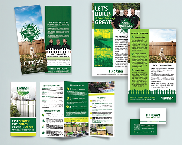
Finnegan Fence
Logo, Brand, & Business Collateral Design
For Finnegan Fence Company, I created a flexible logo and ongoing brand system that supports the business across print, apparel, signage, and promotional materials.
The logo system includes multiple variations (primary and secondary marks) to ensure adaptability across formats and mediums - from small digital badges to large‑format yard signs and vehicle wraps. This flexible approach helps maintain brand consistency whether it’s on business cards, flyers, brochures, door knockers, apparel, hats, or yard signs.
Podcast Branding
Logo, Podcast Artwork, Branding
For the I Still Believe in School podcast, I designed a logo that captures both the heart of education and the optimism at the core of the show. The visual style draws inspiration from handwritten notes and classroom doodles, bringing a sense of authenticity, nostalgia, and human connection that reflects real educator experiences.
The typography leans playful yet intentional, balancing approachability with professionalism to ensure it resonates with both educators and a broader audience. Subtle design elements echo familiar classroom visuals, reinforcing the theme without feeling overly literal.
The result is a mark that feels personal, encouraging, and genuine...mirroring the podcast’s mission to highlight the positive stories in education while acknowledging the realities teachers face.
